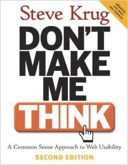
RATING: 9/10
Filled with numerous examples, Don’t Make Me Think guides you along the path of designing a useful “thoughtless” website.
Notes:
Usability really just means making sure that something works well: that a person of average (or even below average) ability and experience can use the thing—whether it’s a web site, a fighter jet, or a revolving door—for its intended purpose without getting hopelessly frustrated.
If something requires a large investment of time—or looks like it will—it’s less likely to be used.
I should be able to “get it”—what it is and how to use it—without expending any effort thinking about it.
On the Internet, the competition is always just one click away, so if you frustrate users they’ll head somewhere else.
Web Design 101:
-Create a clear visual hierarchy on each page
-Take advantage of conventions
-Break pages up into clearly defined areas
-Make it obvious what’s clickable
-Minimize noise
If you’re not going to use an existing Web convention, you need to be sure that what you’re replacing it with either (a) is so clear and self-explanatory that there’s no learning curve—so it’s as good as convention, or (b) adds so much value that it’s worth a small learning curve.
It doesn’t matter how many times I have to click, as long as each click is a mindless, unambiguous choice.
I think the drawbacks of pulldowns outweigh the potential benefits.
If you want a great site, you’ve got to test. After you’ve worked on a site for even a few weeks, you can’t see it freshly anymore. You know too much. The only way to find out if it really works is to test it.
Testing one user is 100 percent better than testing none.
Testing one user early in the project is better than testing 50 near the end.
The point of testing is not to prove or disprove something. It’s to inform your judgment.
Most of the time on the web, people don’t want to be engaged; they just want to get something done, and attempts to engage them that interfere with their current mission are perceived as annoying, clueless, and the worst kind of hucksterism. And attempts to add sizzle almost always get in their way.
