In 4 years, I have helped grow Intelligent Change 10x to multiple seven figures combining my high level strategic skills with hands on writing, design, and data analytics.
OVERVIEW
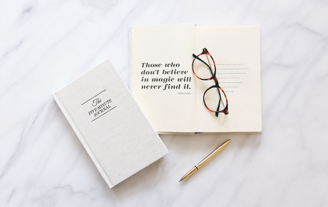
As a fan of The Five Minute Journal, a daily guided gratitude journal, I wanted to help Intelligent Change spread their product to more people. I pitched them some marketing ideas and began a free 1-month trial to prove myself. Happy with my work, I was brought on part time to help grow the company with my initial focus building out an email program and aiding in their upcoming product, The Productivity Planner.
WHAT I DID
Brand Strategy
Brand Messaging
Product Design
UX + Visual Design
Marketing & Advertising
THE PRODUCTIVITY PLANNER
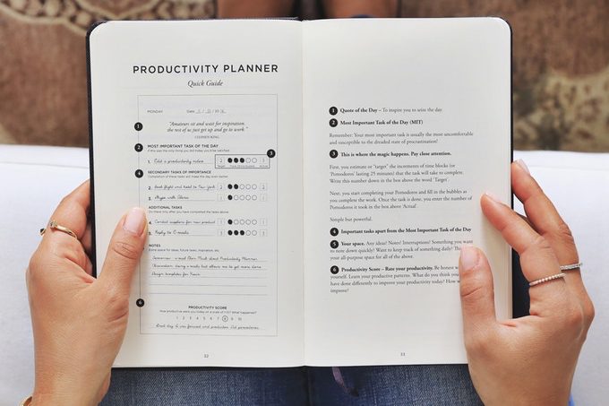
The goal was to create a planner that actually helped you get work done versus merely organizing your week (what most planners do). I was brought in to help refine the overall layout and structure of the interior content as well as do heavy edits to the introduction.
The result was combining a prioritized to-do list based off the Ivy Lee Method (doing your most important task first) with Pomodoro time tracking (work for 25 minutes uninterrupted, take a 5 minute break) + a weekly planning and weekly review section. Whereas before I came on, the main focus was going to be all about Pomodoros, I helped refine the structure to being Most Important Task focused.
My next job was leading the launch of the planner on Kickstarter. After researching similar Kickstarters in our space and reaching out to past successful Kickstarter founders, I did the entire layout, copy, design, and pricing tiers. Next, I compiled a list of media, influencers, and warm contacts. I personally reached out to notify them of the kickstarter and create email templates for their list around launch day.
After running a 30-day campaign, we did over 12x our funding goal raising $126,000.


THE FIVE MINUTE JOURNAL APP
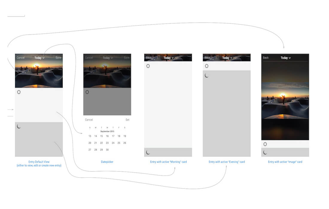
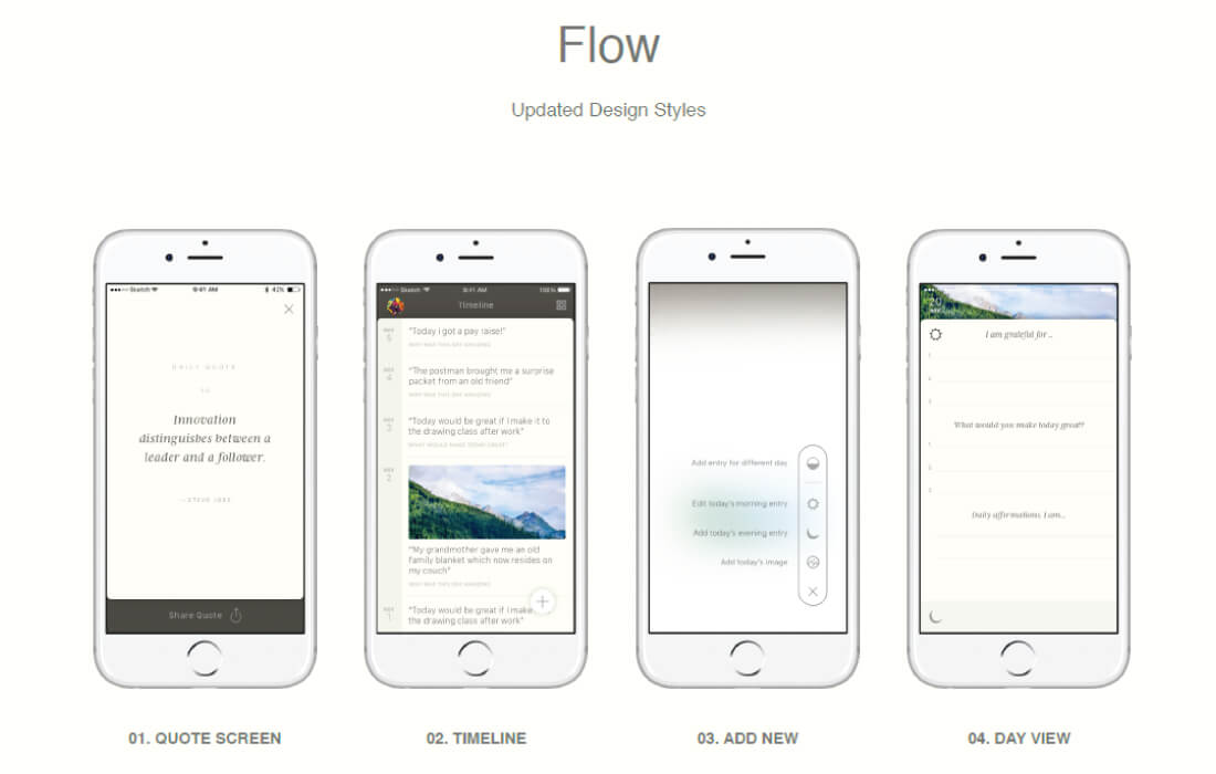
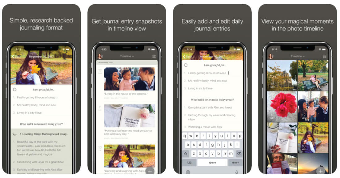
A previous Five Minute Journal app was created prior to me coming on which was buggy and left much to be desired UI wise. Working with developers Userbrain, I helped refine the UX and UX writing of the app.
Once completed, I was tasked with launching the app including creating the app store listing, description, and screens. Additionally I created a 3-part email drip series to our email list, social media posts, and again outreach with notable influencers, media, and warm contacts in our space.
The result was we hit #1 in lifestyle, became iTunes pick of the week, and the success of the app led to partnerships with Starbucks and Humana. The app still consistently sits in the top 15 in Lifestyle apps today.
THE FIVE MINUTE JOURNAL FOR KIDS
With many parents loving The Five Minute Journal, many reached out with hopes we would create a Kids version. With feedback we couldn’t ignore, I was tasked with creating a Kids version of The Five Minute Journal from start to finish.
New to the Kids market, I began several weeks of research on Mom bloggers, children’s books, and gathered feedback from parents and teachers. This provided a solid understanding for capturing the soul of The Five Minute Journal and translating it to a younger audience that parents and teachers would love. I wrote the entire introductory copy which would see several rounds of edits with the team and extra pair of eyes from an editor friend.
From here, I researched several illustrators to bring the introduction to life (because what children’s book would be complete without illustrations!) and decided on the talented Nina Popovska. Providing guidelines for the look and feel, I worked together with Nina to refine the illustrations and bring them to life in color.
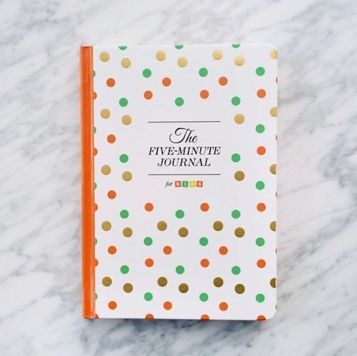
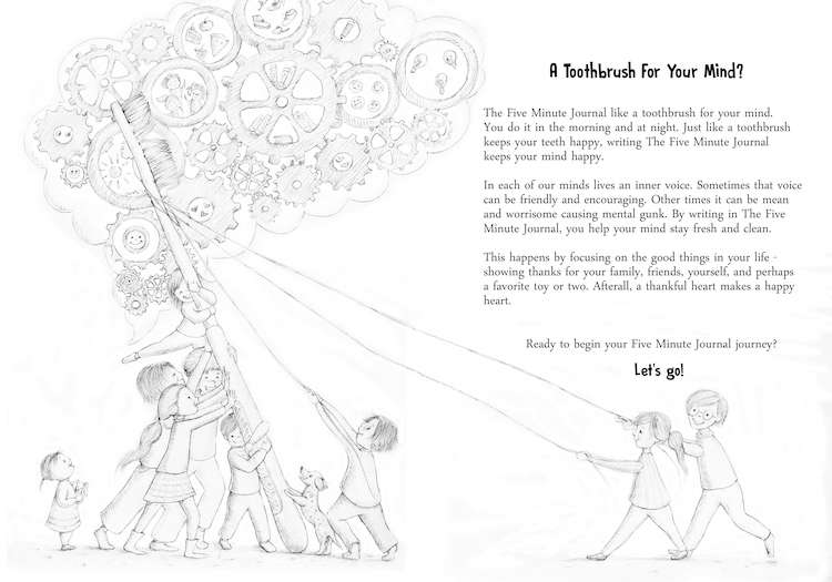
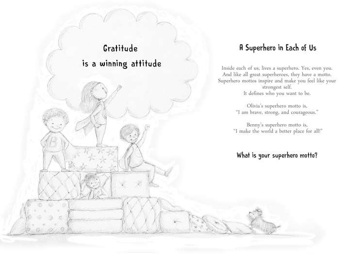
With the illustrations in progress, I worked with Florencia B to design the style and format of the journal. Seeing as how the introduction was going to be full illustrated, it seemed natural to do the entire daily format in color as well.
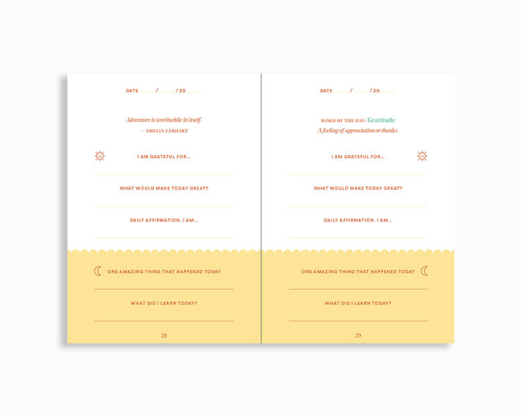
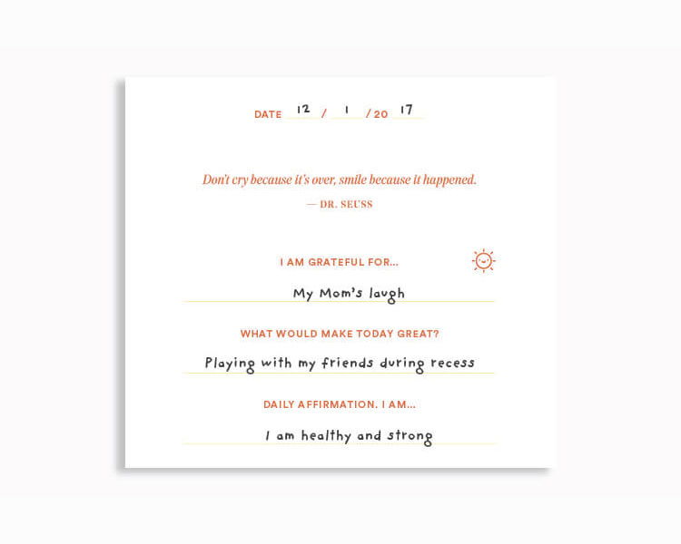
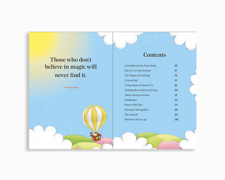
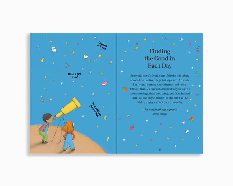
After several more rounds of edits to the introduction, edits to the design, illustrations, and cover design, The Five Minute Journal Kids was born.
Next up was launching the product on Kickstarter. I led the entire project from layout, design, copy, and outreach. With an initial $10,000 goal, the project did just shy of $60,000 and raised an additional $15,000 via BackerKit (payment portal with upsell options after Kickstarter).
EMAIL MARKETING
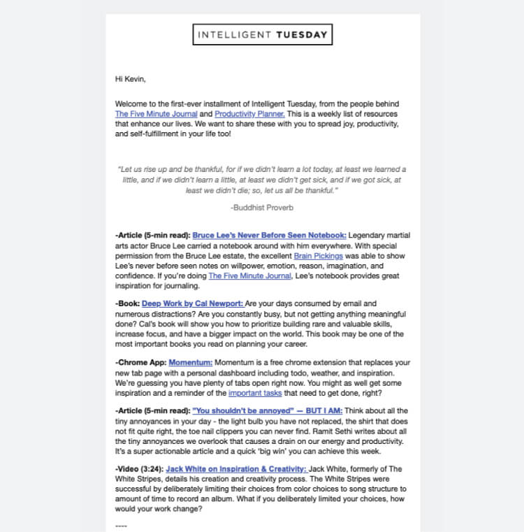
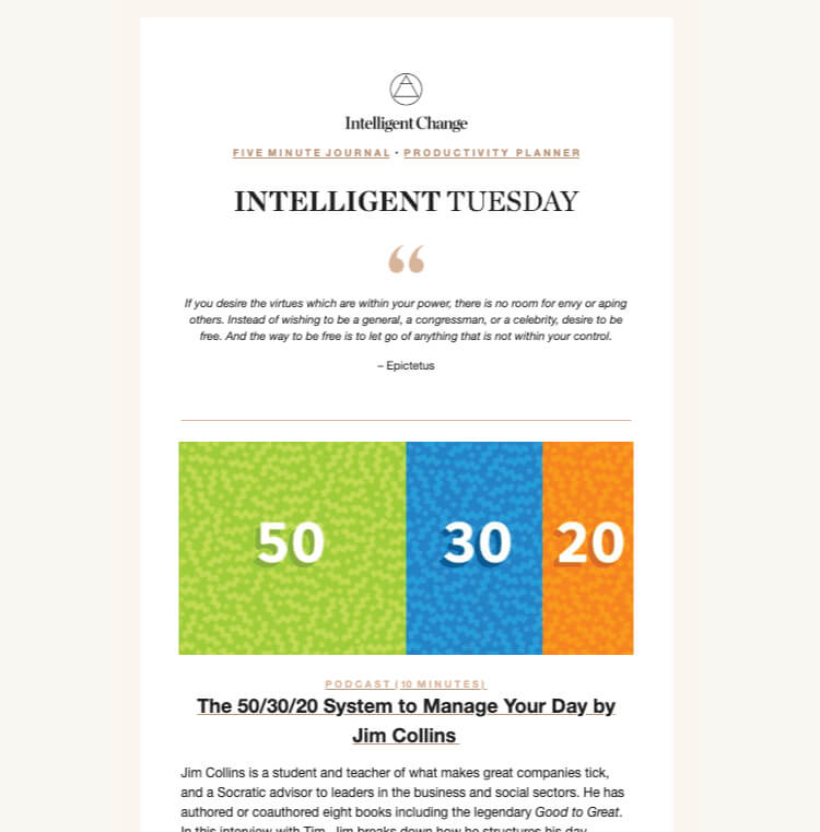
When I came on board, Intelligent Change had a list of a few thousand people that they emailed only three times within a year. My primary role when first coming on was to re-engage and grow this list.
Over the course of 4 years, I transitioned Intelligent Change from MailChimp to the Shopify centric (what IC runs their ecommerce business on) Klaviyo, establishing a weekly cadence of emails, automated flows, and a complete branding re-design. The result was an active list of 100,000 subscribers seeing regular mass open rates of high 20%.
WEBSITE UX
When I first began at Intelligent Change, we only had one product, The Five Minute Journal, and a website of the same name. With plans to expand our product line, we needed to house multiple products under one roof, Intelligent Change – the company behind the journal.
The original iteration of www.intelligentchange.com was done quickly with an agency to address this problem. Navigating the site left much to be desired, updating the backend without the use of developers was tricky, and the overall aesthetic did not match our products.
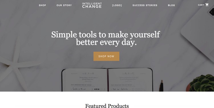
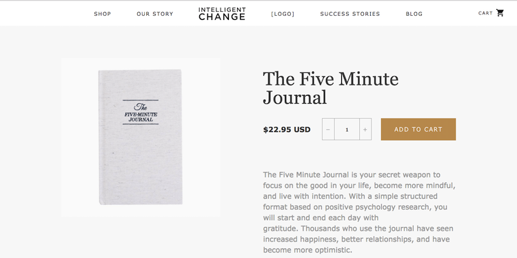
Working with Nguyen, an independent designer, and Fuel Made, website developers, I was tasked to lead the re-design of the site. The first step was establishing our overall look and feel. Intelligent Change is a brand dedicated to helping people become their best selves through actionable tools and advice. We wanted a typeface that felt classic and a light color scheme that matched the look and feel of our products. We decided on Freight Text for headers and body text and Proxima Nova for the navigation, buttons, and subtitle texts.
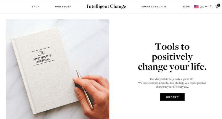
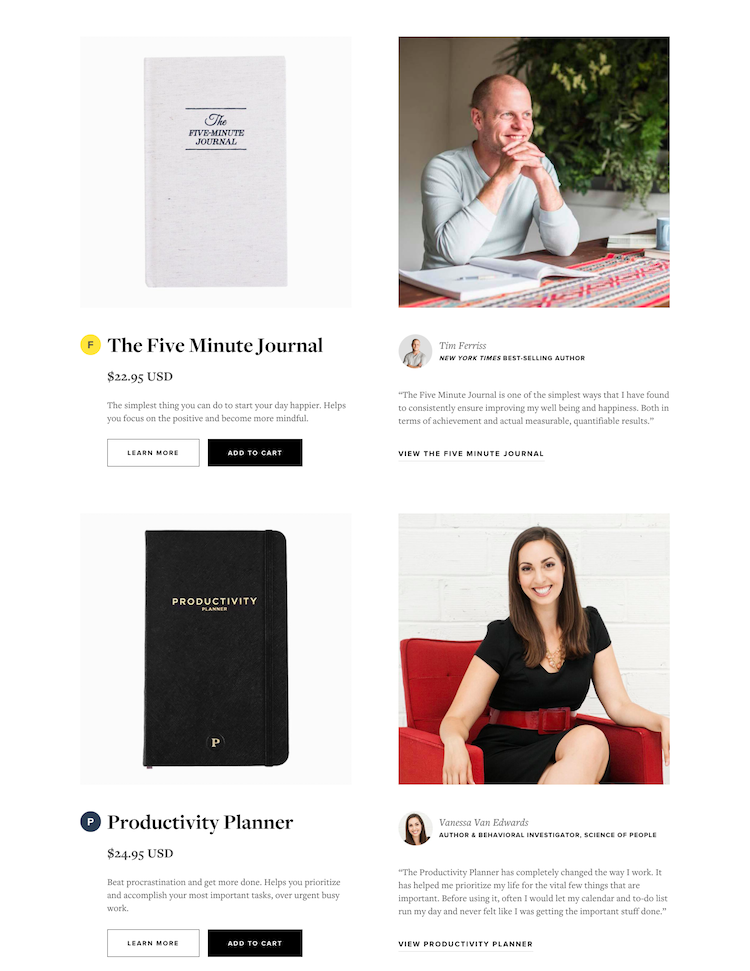
As ‘increasing happiness’ and ‘boosting productivity’ can seem like a BS claim, we wanted to showcase that our products actually worked by those who consistently used them.
A big piece was adding testimonials from our well known supporters on the home page and shop page next to the products to increase trust and humanize the brand. I further added a success stories page clickable from the navigation bar to showcase additional stories of those who loved our products.
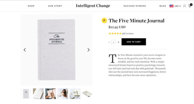
As our product pages get the majority of site traffic, this is where we spent the most of our time. Prior, we had few product pictures, the site was mobile unfriendly, and the copy sounded too professional. All these elements were updated with the added inclusion of product reviews and an app that automatically changes the currency into the potential customers local currency.
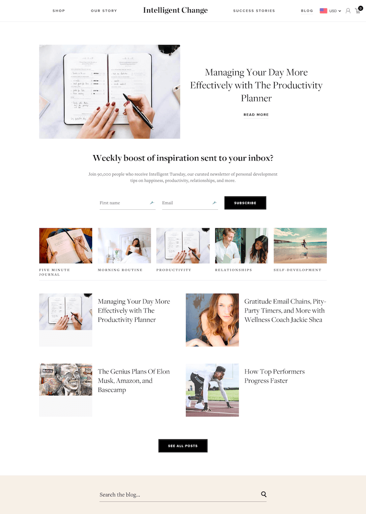
The final big piece was updating our blog. The blog got a fresh update with a feature article leading the way, a featured email sign up, blog categories, search, increasing the font size to make it more readable, and including sharing buttons.
